Visualizzazione post con etichetta Tony Ackland. Mostra tutti i post

sabato 14 settembre 2019

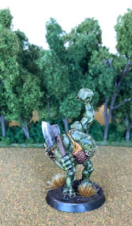
Citadel C025 Fimir Fianna Fim (1988)


Fimir are one of the few original things in the Warhammer setting. They were created, in fact, to be exactly that, at a moment when GW was dealing with the loss of rights over IP from their old suppliers. The credit for creating them goes to Graeme Davis and Jes Goodwin, who in turn inspired themselves from Alan Lee's Fomorian.


Truth be told, the effort to come up with something original was hardly monumental. Fimir had stronger limbs and an ankylosaurus-like tail to be used as a weapon. And that was it. Bryan Ansell probably found out too late, and Fimir became a thing. 


Now, Fimir could really have become popular, if Nick Bibby, the sculptor charged to turn the concept art into miniature, had not botched spectacularly the size of the monsters, which in fluff were slightly heavier than humans, but in lead were Ogre-sized.


This meant that they were heavy and expensive to make and to buy, but in game terms they were not really strong: a line of few large Fimir was easily overcome by a line of smaller creatures. So Fimir didn't became popular, and eventually the Skaven filled their role, and became Warhammer's iconic monster.


Still, in the hearts of fans Fimir always had a place, and among Oldhammerers they remain a collector item, bought at dear price in eBay and other online markets.


I had this miniature for some time and I only managed to paint it because I wanted to test the new Contrast paints by GW. Well, what do you think? Not half bad I'd say, if you consider it took me less than half of the time I normally spend on a miniature this size.


venerdì 12 ottobre 2018

WFRP Gamekeeper Art


This post might sound a bit like I'm bragging, so forgive me, but when one is an art geek, few things make him or her more excited that being able to connect two dots together: to fish into the ocean of details learned and committed to memory, and draw an imaginary line to link them, and tie them into something larger and closer to "the whole picture'.

This is what happened to me when I was able to get an original painting of the Gamekeeper WFRP career, by the legendary Tony Ackland, which now sits in my study, just under the Minstrel.


This picture is where everything started - in 1984-85 T. Ackland was commissioned a set of careers for the publishing of WFRP; he drew this among many, and it eventually made it to the final cut (some careers were expunged for space at the last moment).

In 1985 miniatures were also commissioned by GW to the Perry twins, to go with the forthcoming RPG; among them the C07 Ranger series.


In this range, the Gamekeeper appeared as per Ackland's illustration. And below is my copy, painted.

 
This is how the illustration appeared in the WFRP 1ed Core Rules, published in 1986.


This is hardly the only example: it was normal in GW, at the time, to have a direct cooperation between illustrators and sculptors, each influencing each other. Concept art was created all the time and then another artist would elaborate on that, and that is, in my opinion, what made the Golden Age GW so great. Each and every artist was good and had his/her own style, but all were working in harmony under the wise supervision of J. Blanche.
Do you know any other example of  this? Share it! It's awlays nice to dig into the creative process that led to some of the best gaming products ever, which today we simply classify as: Oldhammer.

lunedì 4 dicembre 2017

The Gamekeeper - Citadel Ranger C07 (1985)


In late 1985 Citadel issued one of the nicest series ever, the C07 Rangers. What was special about this range was that all the figures had been sculpted - by none other than the Perry twins - on the base of Tony Ackland's Ranger careers illustrations from the upcoming Warhammer Fantasy Roleplay, published the following year.


If you have played WFRP and, as a teenager, spent whole afternoons pondering your PC's future career path while looking at Tony Ackland's drawings, you may well understand why this post is tagged #iconic.


This is the description of the Gamekeeper career from the rulebook:
Most Old World landowners employ Game­keepers to look after their estates, woodlands or hunting parks. Gamekeepers look on trespassers with deep and sometimes fatal suspicion. The arch­enemy of the Gamekeeper is the Poacher, who seeks to make a living by trapping or shooting animals or birds. Every Game­keeper likes to boast of his victories over these elusive and devious opponents. Poachers and Gamekeepers can be thought of as opposite sides of the same coin, and players with Gamekeeper characters of a Neutral, Evil or Chaotic Alignment may choose to be Poachers instead. Gamekeepers or Poachers may take this career a second time, taking the 'op­posite' career, following the normal pro­cedures for changing careers.
This was the true spirit of the Old World setting that, unfortunately, has largely been lost over the years to grimdark tones. Nowadays the archenemy of Gamekeepers are probably Chaos Beastmen (or Gors, as the fluff goes) and these professional are seldom seen without a trusty gunblade and a number of skulls attached to their belt. But enough of grumbling, as this post is not tagged as #grognard.


No grim trophies or fancy firearms for our Gamekeeper, but rather a bow, a quiver slung over the shoulder, a pouch, a dagger and a sword hung at the belt. He wears shoes and gaiters, breeches, a cape with lobed edges over a long tunic, and a hat with folded edges. Looking at him we know he cares about practicality and comfort, but at the same time he or his master are able to afford good quality clothes. He's fully equipped for adventure and he seems to be moving a branch aside to spy on something or someone.


In case you didn't notice, I used a different approach at painting this time. Since I had used practically all my dull greens for the different layers of clothing, my only option was to highlight with the original colour of each layer mixed with white. The final effect is less realistic but more like a painting, I find. I am not totally displeased with this approach and I might use it again in the future, especially for monochromatic colour schemes. Of course in this case the figure is not only green, but has been balanced with a range of warm browns.
 
Looking back at it, if I had to paint it again I would break the dark greens with some lighter ones to create more contrast. But this time I'll just be happy with this!

sabato 14 ottobre 2017

Citadel Slann and their successors


When you reach the venerable age of 38 and you're still into miniatures, most people will tend to consider you a child who never grew up, but that's not entirely true. Children are children, all right, they are in love with the hobby, but something inside of you is different, and that's the part that proves that you are not child, but in fact an old man. A grumbly old man.

All of us, even those who have the bravery to admit that AoS is actually cool, have succumbed at least once (or more) to the urge to grumble. Italians have a nice word for it: brontolone. Bronto- come from the Greek and means "thunder" (as in brontosaurus, yes) and fittingly calls to mind the image of a distant storm on the horizon, lightning flashing, thunder quietly rolling - all of the evening. There might be even some raindrops on your car, just to make it dirty, but no big actual storm. Just this constant and useless rolling thunder. The French have another word: grognard. That's the word I'm gonna use to tag all posts whose content could be summarized into "back in my time, things were different". Young people rant, we do not: we grumble. Face it, it's in our nature.

This was a very long preamble to introduce the subject of Slann miniatures. We all know who the Slann are (or were, back in my time before the retcon). But where do their concept come from, originally?

I believe the first sketch ever of the Slann might be this piece by John Blanche, titled "Troglodytes", which I found on Ratspike. In spite of the name, these are clearly Slann: the shape of the head, the armour, even the pyramid in the background.

A more mature sketch is the following, also by Blanche. Here the Slann have already developed their name and are drawn in more confident strokes.

After this, GW's staff set themselves to work. Tony Ackland drew Slann for the 2nd Edition of WFB (1983), and also in the later articles Kremlo the Slann (1983) and the Magnificent Sven (1984):


Moreover at the same time, in 1983-1984 - difficult to tell if illustrators influenced sculptors, or it was the other way around - the Perry twins sculpted the first, glorious C32 figures.


These were quite succesful and, in 1986, Citadel issued a new series of Slann, sculpted by Trish Morrison. And these were beautiful, too: it was difficult to spot the difference with the Perry pieces.


Then, for no apparent reason, something terrible happened. The 1987 new Slann relase, designed together by Trish and Aly Morrison, came out, and they looked nothing like the originals:


The new Slann looked more like clumsy toads trying to stand on two feet (with little success). Heads became wide and flat, eyes bulged out and torsos almost disappeared. This was the end of classic Slann: the whole "amphibian master-race from Space" concept was forgotten and, in 1997 they were retconned in favour of the Old Ones and the Lizardmen.

What was left to us, with the name Slann, was this. A bloated, big-headed toad:


And that's the end, as far as GW is concerned. But a lot of people still loved the Slann and independent manufacturers tried to support them with new figures. For some reason, though, most of them were more frogmen than actual Slann as we knew them.


I believe Mirliton's Kermitians were the first. I have a lot of respect for Mirliton, and that's why I will not comment on these figures.


Then it was probably Ral Partha who issued their Bullfrogs. They had way more character than Mirliton's Kermitians, but still looked like anthropomorphic frogs.


Reaper Frogmen are suspiciously similar to the previous, with a bit detail, but with the same inherent flaws.


Otherworld Boglings are less frogs, and more TMNT from the movie (the ugly ones).


Mantic's Frogmen are just more of the same. Good figures, mind me, but nowhere close to the original Slann. These are frogmen, period.


Katsina were the first to give up the "frog on two legs" idea and get closer to the original, with exotic weapons and feathered helms. These are nice, but still only a first step towards the original Perry. To put it clearly: put them on a table next to each other, and you will spot the difference from three metres distance.


And just when everything seemed lost, lo! Tim Prow comes out with the Eru-Kin. And let me say: these are the nicest Slann-like miniatures made after 1986.

Diehard brings out all the old colour (light armour of plates + leather strips, round shields, feathered helms, weird weapons and a meso-American feel) and adds some more in the same tune: this is how you do good Oldhammer in the 2010s. Sure, you say, there is significant difference in the heads:


On one side, a big, tall, bloated head. On the other a more lizard-like, long and flat one. Sure, copyright is still a thing and GW isn't kind to those challenging them. You can't call them Slann. You can't do them exactly the same as John Blanche first drew them. Still, these to me look more "right" than the 1987 Citadel toad-people.


In a perfect world, we would have a second set of heads to replace the lizard-like ones, but in the meantime I must say I am very happy about these. Will probably try to fix them with some greenstuff: I'll let you know how it goes. But even without any fix, this is a huge step in bringing Oldhammer back. Well done, Tim Prow!