Follows from
Part II.
While the '80s were an age of experimentation and the '90s a time of development of a visual language for a new setting, the following decade saw John Blanche sit back and let the other artists of GW proceed along the route he set.
A turning point of Blanche's influence on Fantasy is probably Mordheim, published in 1999. This is the moment when the Old World stops being anything else than Blanchitsu. It's medieval fantasy Necromunda, on steroids. It has all the elements: deformity, madness, skulls, spikes, scrolls used as garments and oversized weapons. In one word, Grimdark.
After Mordheim the way is finally paved and Warhammer Fantasy's frames are drawn. Not that there isn't space for creativity within the studio, but it is limited, and mostly concentrated in the fields that aren't Blanche's direct interest, namely the forces of good like High and Wood Elves, Bretonnians and Dwarfs. Yet even on those Blanche manages to leave his mark, in the form of ridulously large and elaborate helms and headdresses, elaborate clothing that is either form-fitting or oversized, frequently both on the same figure and, of course, skulls.
WFB 6th edition (2000) has only two tables from Blanche, and there's no contribution of his at all for the Army Books, except for a few small sketches. It is clear that Blanche's interest lies elsewhere and, once the necessary job is done, he returns to work on the things that truly inspire him.
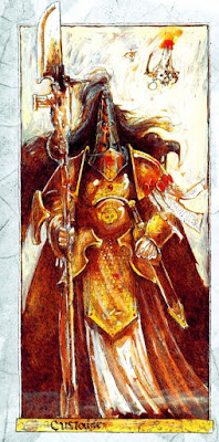
It is in this period that Blanche starts adopting a typical format for his works: single characters concepts, full figure, no background, made on small size sheets (A4 or smaller), in pencils/ink and with occasional watercolour/acrylic ink. Inquisitor (2001) is the perfect example (if you think these look way better than those of Fantasy, you are right but we'll discuss this later).
Completely gone are the large colour paintings of the past, and when colour is used the palette is extremely limited to the main colours brown/vermilion/yellow/off white.
WFB 7th edition (2006) is another perfect example of the new approach: Blanche does not draw any large table for it, but contributes with his sketches, and places a particular care on "evil" factions such as Beastmen, Skaven, Undead and Daemons. He does revisit the old art in his own style, occasionally introducing some new designs and elements, and this becomes the model for all GW's art. It is the triumph of Blanchitsu, elevated to "official" standard, a conscious departure from classic Fantasy tropes to make GW's product unique, but also the death of all other styles that made Warhammer so diverse and interesting.